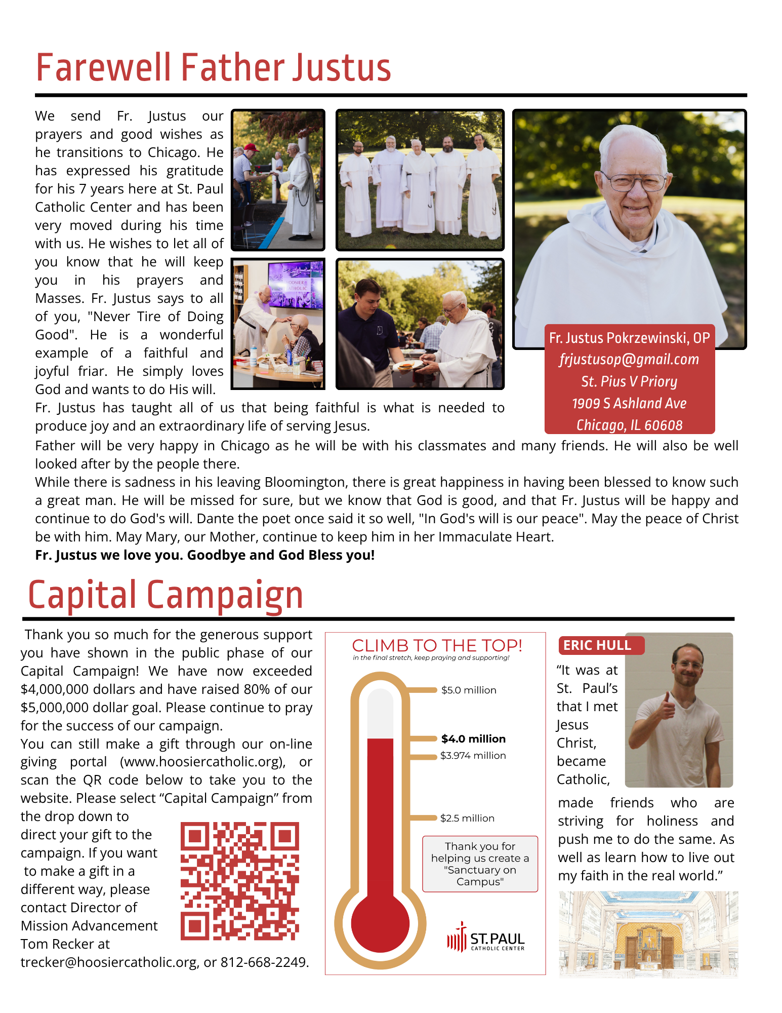
Saint Paul’s Projects
Instagram Story Highlight Project
Click the icon to see each highlight!


Instagram Assets
Most of the content I create for Instagram focuses on promoting events and activities at Saint Paul’s. Below are examples of my recent work featured in posts. My priority is always to communicate the message clearly while using design elements to keep the content fresh and engaging.

One of my favorite designs celebrates the canonization of Saint Pier Giorgio Frassati and Saint Carlo Acutis. The simplicity of the illustration allows the focus to remain on the saints, while the bold text and clean layout draw attention and create impact. This piece highlights my ability to balance minimalism with meaning, resulting in a design that is both modern and reverent.

In this promotion for the Eucharistic Procession, I used a splicing technique to place emphasis on the priest. The design is clean and simple, effectively highlighting the importance of the upcoming event while keeping the message focused and impactful.
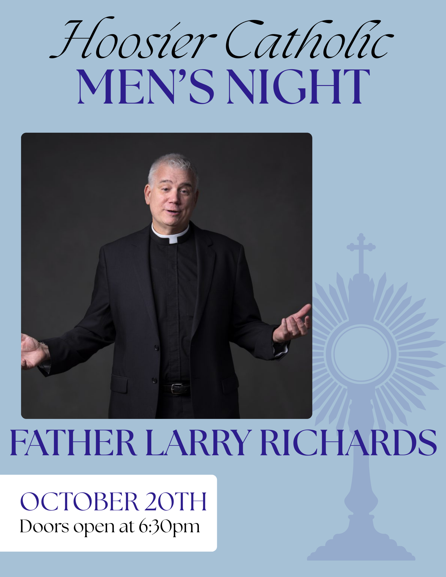
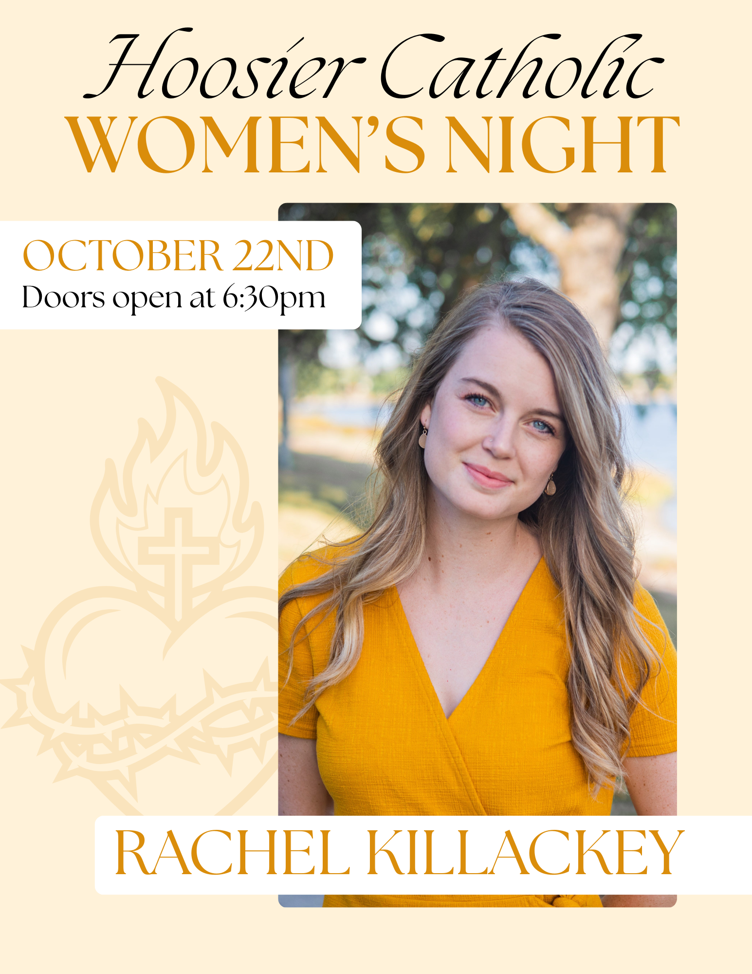
Once a semester, Saint Paul’s hosts both a Men’s Night and a Women’s Night. Since these events are complementary, I designed their advertisements around a shared theme. Maintaining consistency in typography, imagery, and headlines was key to creating a cohesive look while still distinguishing the two events.


These two advertisements are similar in style yet convey different emotions. I enjoy providing my supervisors with a variety of options so they can choose the tone that best fits their goals. This approach also allows for differentiation when promoting content multiple times, keeping the message fresh and engaging.


For the most recent retreat, I created an advertisement by pulling colors directly from the featured photo to establish a cohesive design. I layered the text behind the photo, making use of negative space to keep the layout clean while conveying the emotion of fellowship and inviting students to attend. The final design balanced simplicity with warmth, ensuring the message felt both approachable and inspiring.
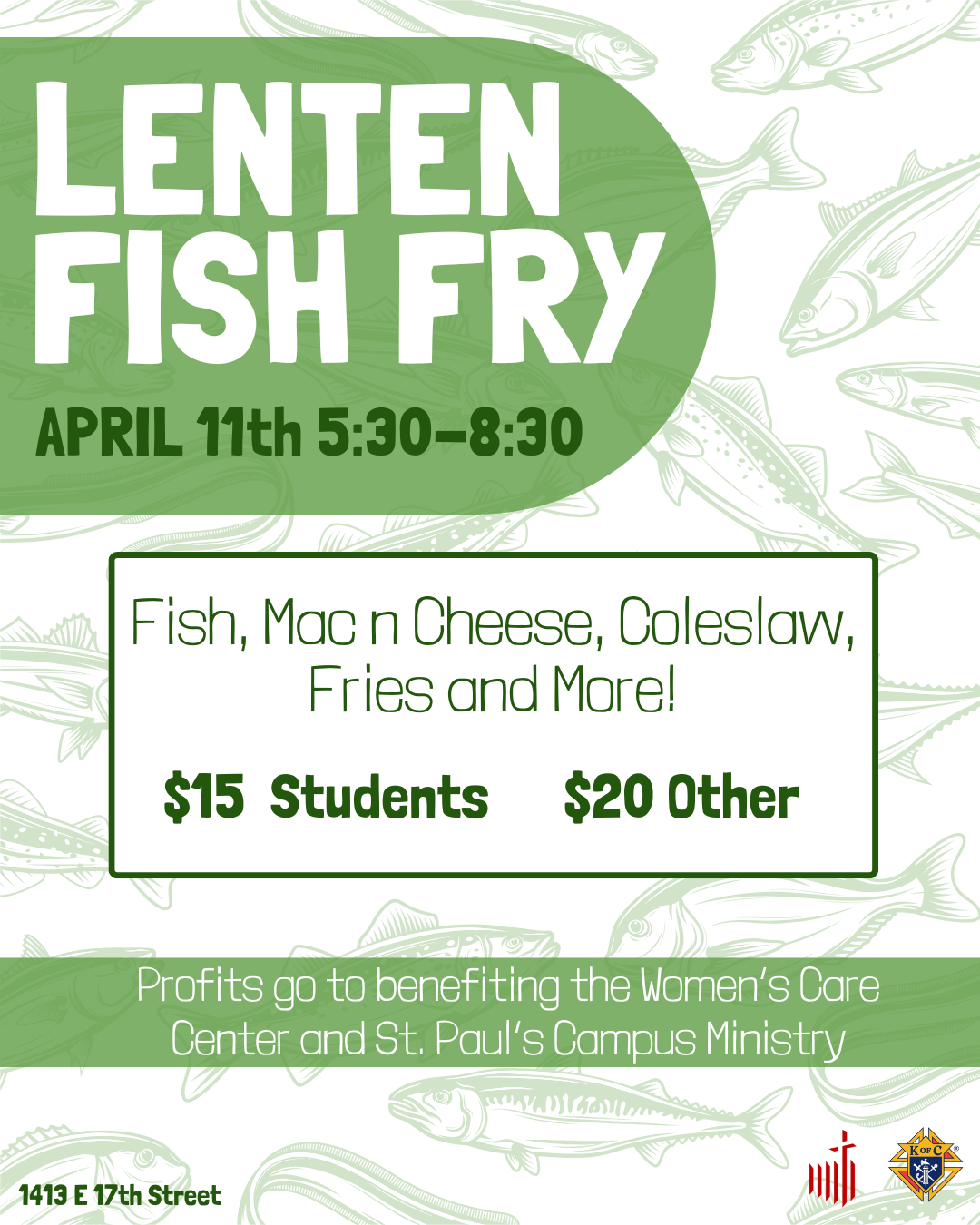
In this promotion for the Fish Fry, I paired a playful fish-themed background with a lively font to create an engaging and inviting advertisement. Since the design needed to include a large amount of information, I made intentional use of negative space to ensure the content remained balanced and easy to read.
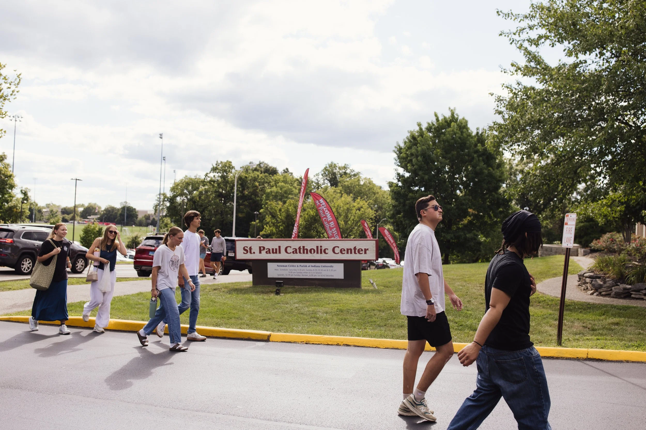
I designed signage pieces in InDesign, tailored to exact dimensions and intended for daily foot traffic. These projects emphasized clarity, brand consistency, and visual impact in a physical space. The goal was to catch the attention of students quickly and make information easy to understand as they passed by.
Physical Media


For this Prayer Teams sign, the goal was to capture attention during Adoration when prayer groups are present. Previously, a small handwritten marker sign was used, but I redesigned it with a bold, professional layout that clearly communicates the message. Since its introduction, prayer teams have seen increased foot traffic, with the bold title making people immediately aware of their presence..
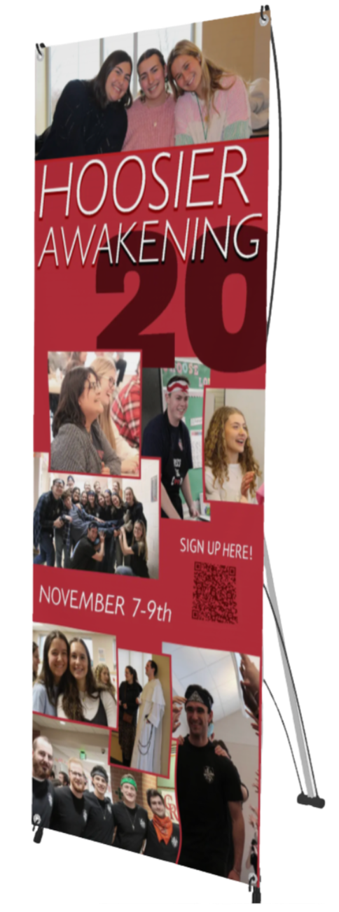

For the Hoosier Awakening 20 retreat L-banner, it was important to convey themes of community, fellowship, and personal identity. I emphasized Saint Paul’s brand red while using layered text, images, and borders to create depth and visual interest, ensuring the design felt bold and inviting.
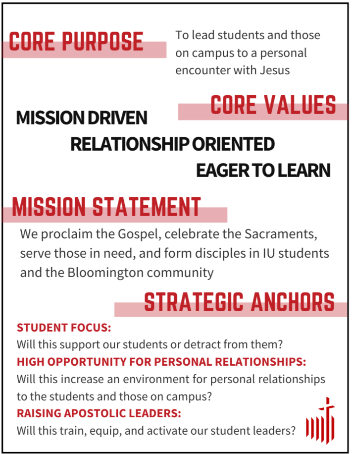
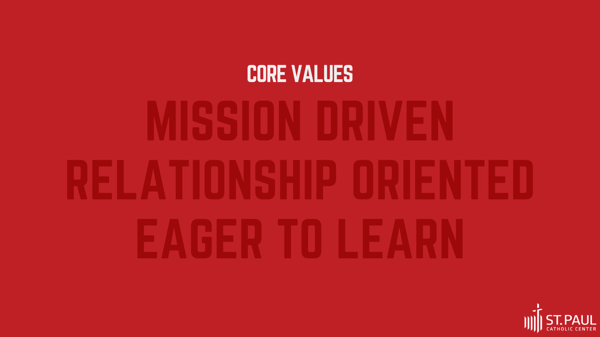
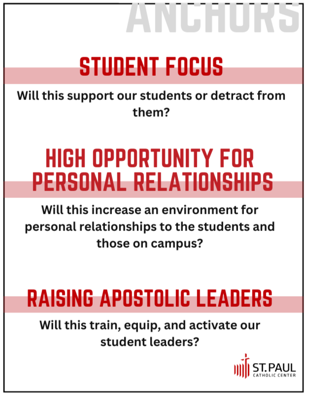
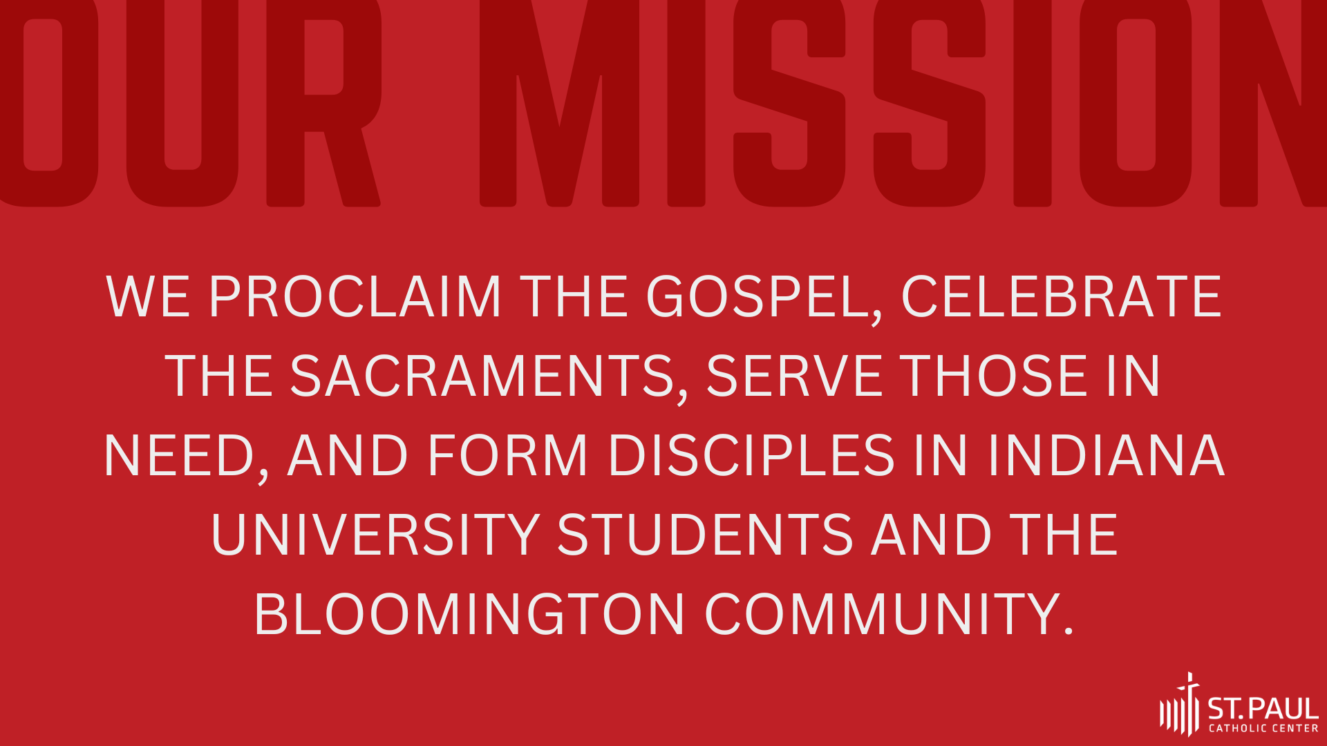
Mission Values Package
I designed four graphics that highlight Saint Paul’s mission and identity as an organization. The designs maintain consistency and present information in a visually pleasing way. These graphics are intended for staff use, serving as a reference to guide decisions, reinforce Saint Paul’s values, and remind the team of organizational goals.
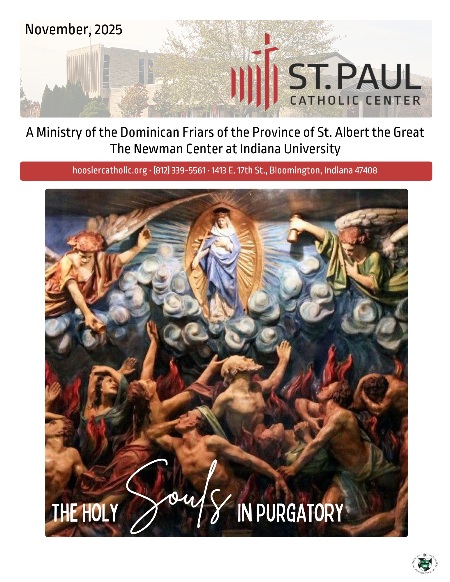
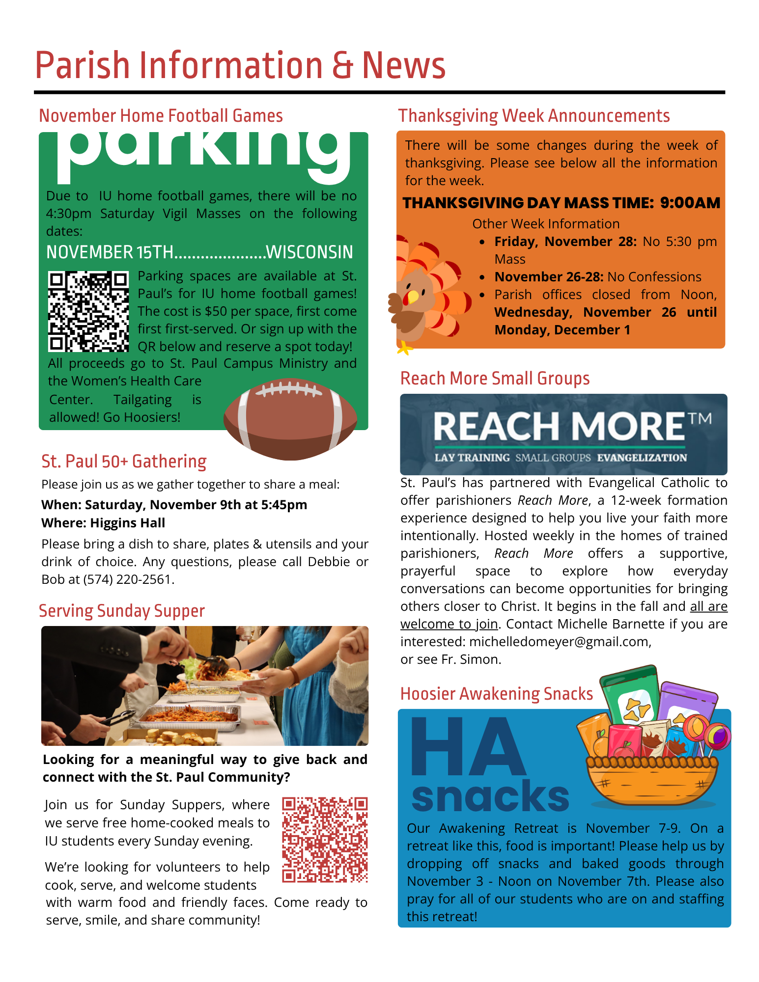
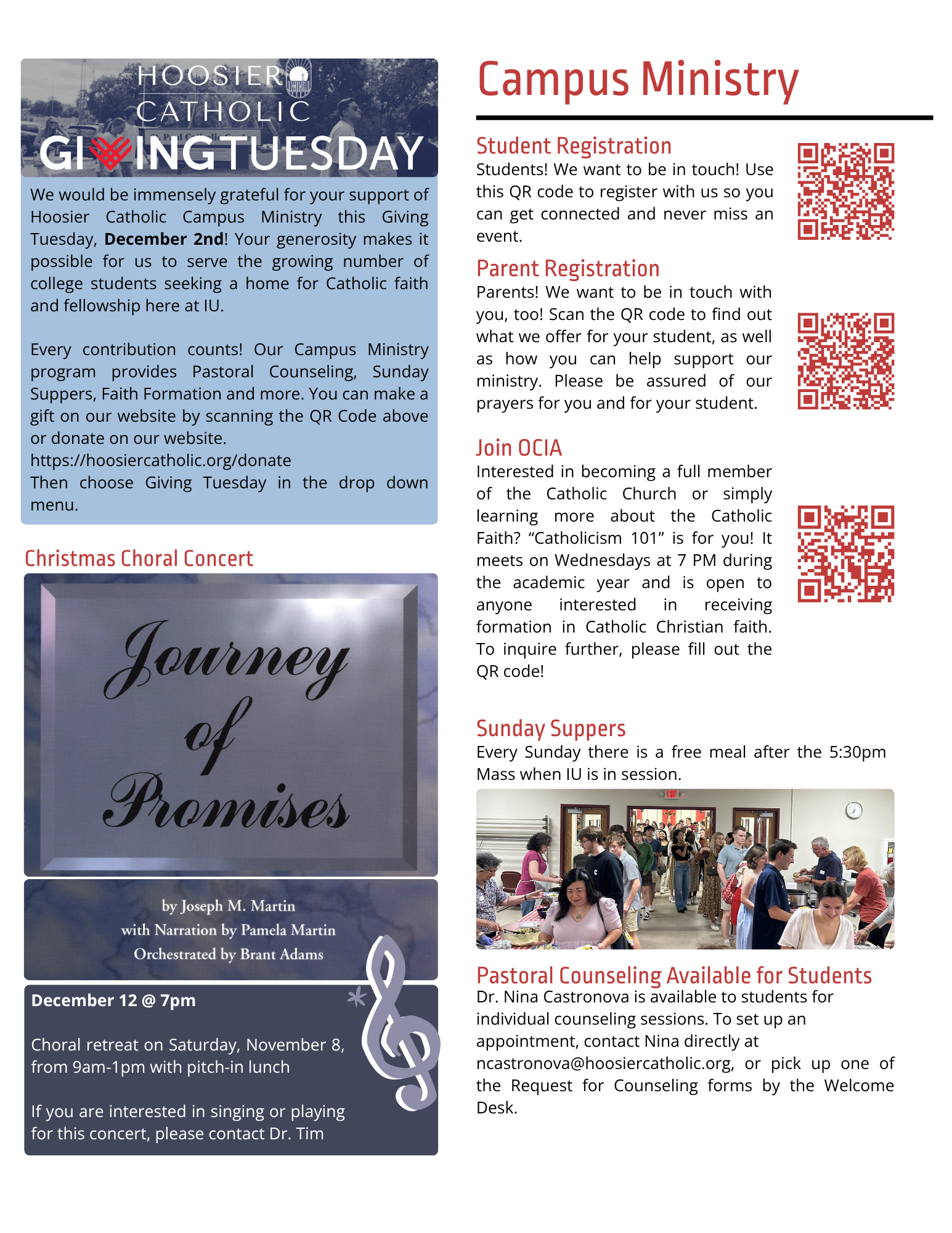
The monthly bulletin is printed and distributed to parishioners, featuring thematic content designed with Saint Paul’s brand colors for consistency and visual cohesion. With six pages to work with, formatting can be challenging, but the goal is always to present content clearly and effectively. I focused on guiding the reader’s eye to the most important information—such as using an arrow to draw attention to sign-ups for parish parking—while balancing patterns, structure, and readability.
Monthly Bulletin


E-Newsletters
On a weekly basis, Saint Paul’s sends out an e-newsletter, and part of my role was to design, prepare, and update the content each week. While the information is always evolving, my goal was to make the newsletter visually appealing and easy for parishioners to navigate.