Chipotle Analysis
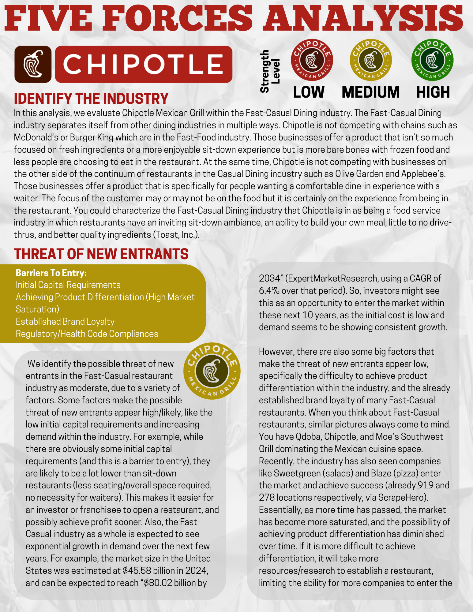

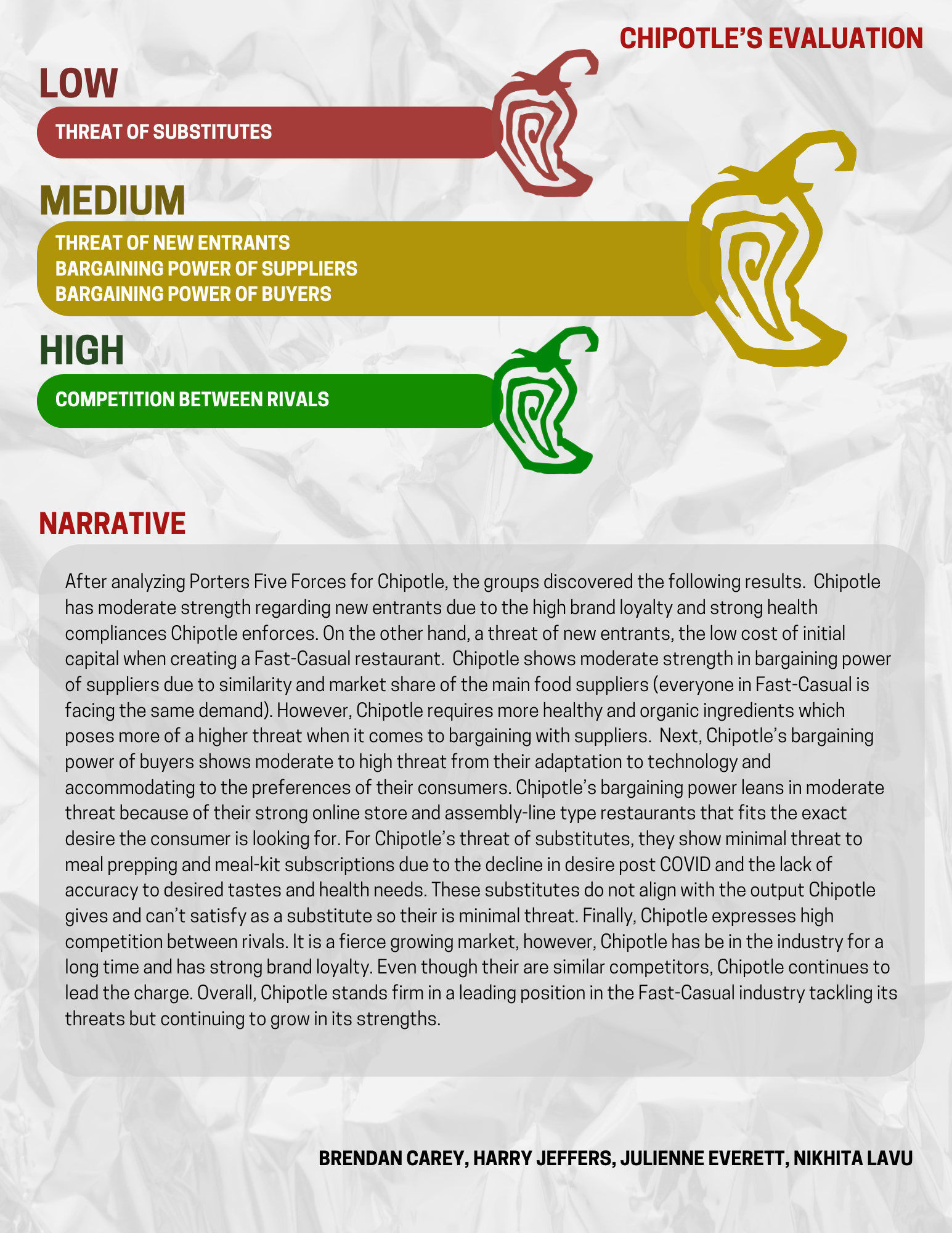
For a Strategic Management project, my team conducted a Five Forces analysis, evaluating Chipotle’s strengths, weaknesses, opportunities, and external threats. I was responsible for designing all content for both the Five Forces analysis and the final presentation. I incorporated Chipotle’s logo, products, and typography, and used an aluminum foil background to reflect their burrito-wrapping theme, while maintaining their brand colors throughout.
Our team received an A on both projects, and the Five Forces assignment earned praise from our professor: “This is one of the best analysis designs I have seen in a long time.” I focused on making complex information visually engaging and accessible, using colors, clean graphics, and design elements to keep the audience interested and enhance understanding.

Pringles Creative Brief
For this Creative Brief, my team and I selected Pringles as our focus brand. I designed the brief to align with Pringles’ products and logo, ensuring the layout reflected the brand’s playful identity. A creative brief is meant to communicate a brand’s message while engaging the audience, and this project balanced rich content with a consistent Pringles-themed design.
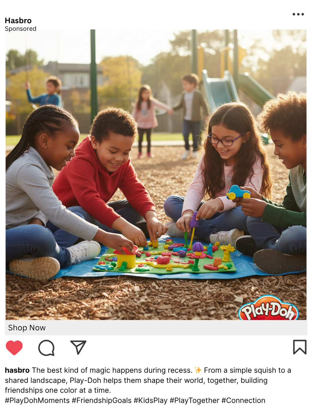
Instagram Ads


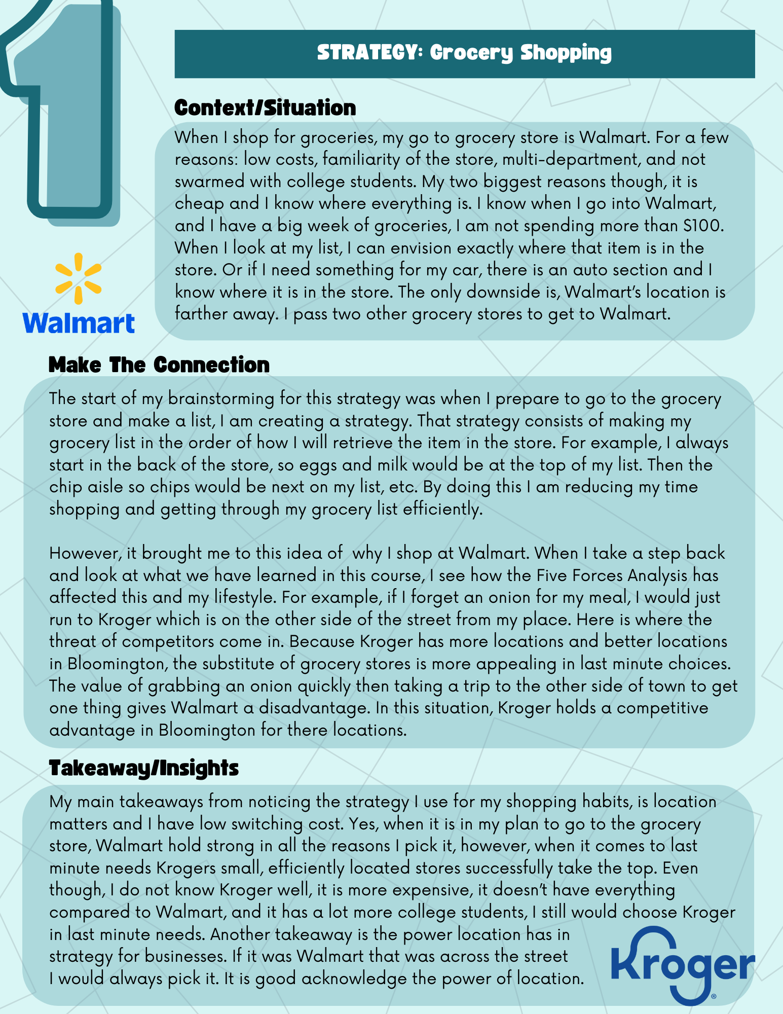
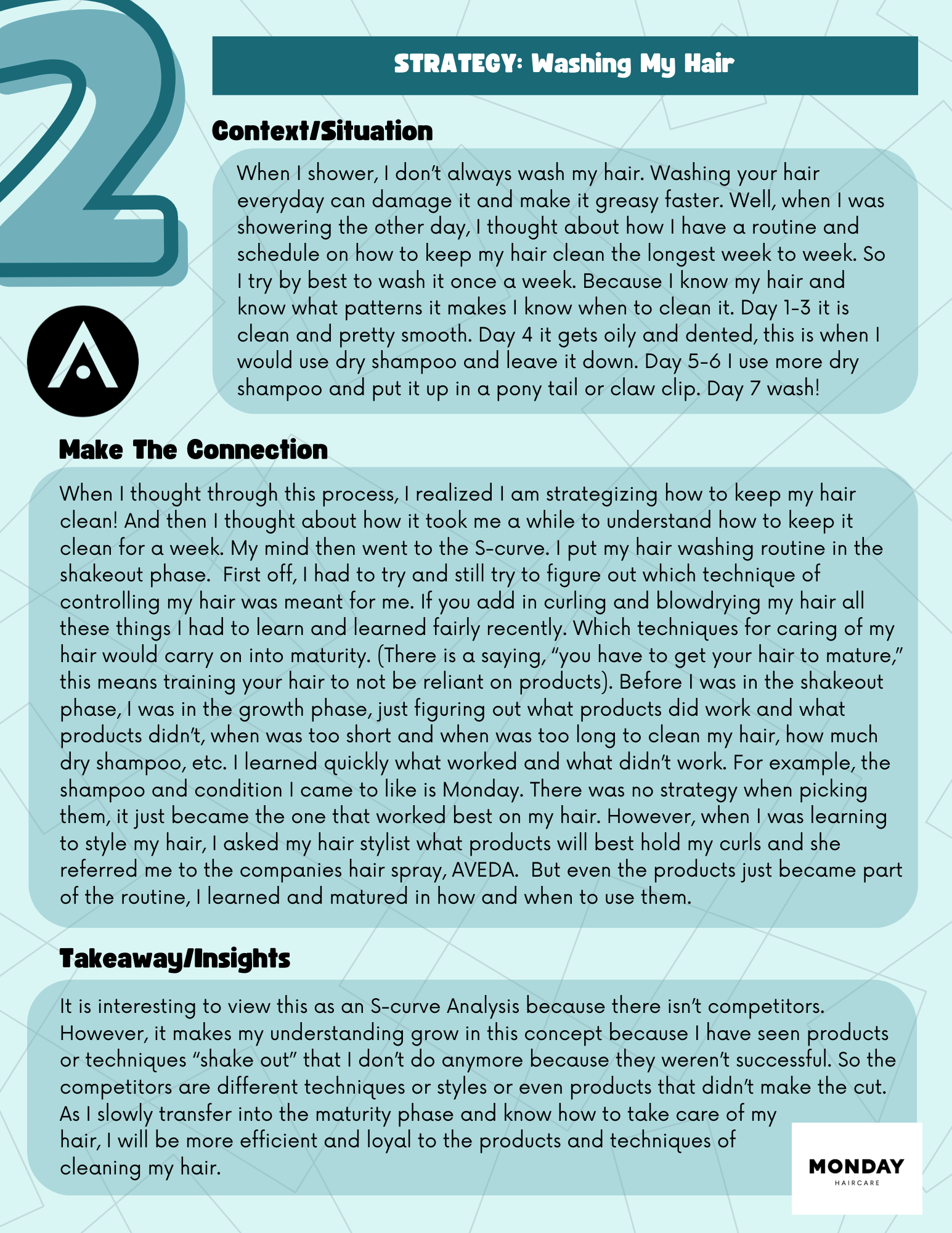
In one of my courses, I was assigned to identify personal strategies for daily living and present them visually. I used soft colors and a clean layout to make the graphic easy to read, turning a simple assignment into a polished and professional design.
Strategy Around Me