During one semester of my college career, my team and I completed a consulting case project that challenged us to create a coffee company—complete with branding, products, promotions, and packaging design.
As the Marketing Director, I led the creative direction and thematic development for the brand. My responsibilities included designing the logo, bottle labels, packaging concepts, and promotional materials, all produced in Adobe Illustrator and Canva to ensure a cohesive and professional brand identity.
The case prompt tasked us with expanding a Dutch coffee shop beyond its four walls and into retail product innovation. We were required to develop two products:
An energy-focused ready-to-drink coffee drink targeted toward a specific market.
An innovative ready-to-drink- coffee product of our choice, with a different audience in mind.
Throughout the process, our team conducted resource analysis to determine whether BigDot could profitably expand into the consumer product space. The result was a set of strategically designed products and packaging that combined market research, branding, and creative execution.
Big Dot Marketing Campaign
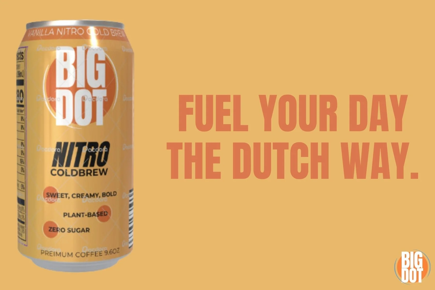
The Big Dot logo, as the name suggests, is a simple yet striking big dot. It incorporates the vibrant orange and blue of the Dutch culture, immediately catching the customer’s eye and encouraging them to stop and notice the product. The soft, inviting shape of the circle draws customers in, while the boldness of the company name ensures the message lingers in their minds long after they’ve seen the logo.
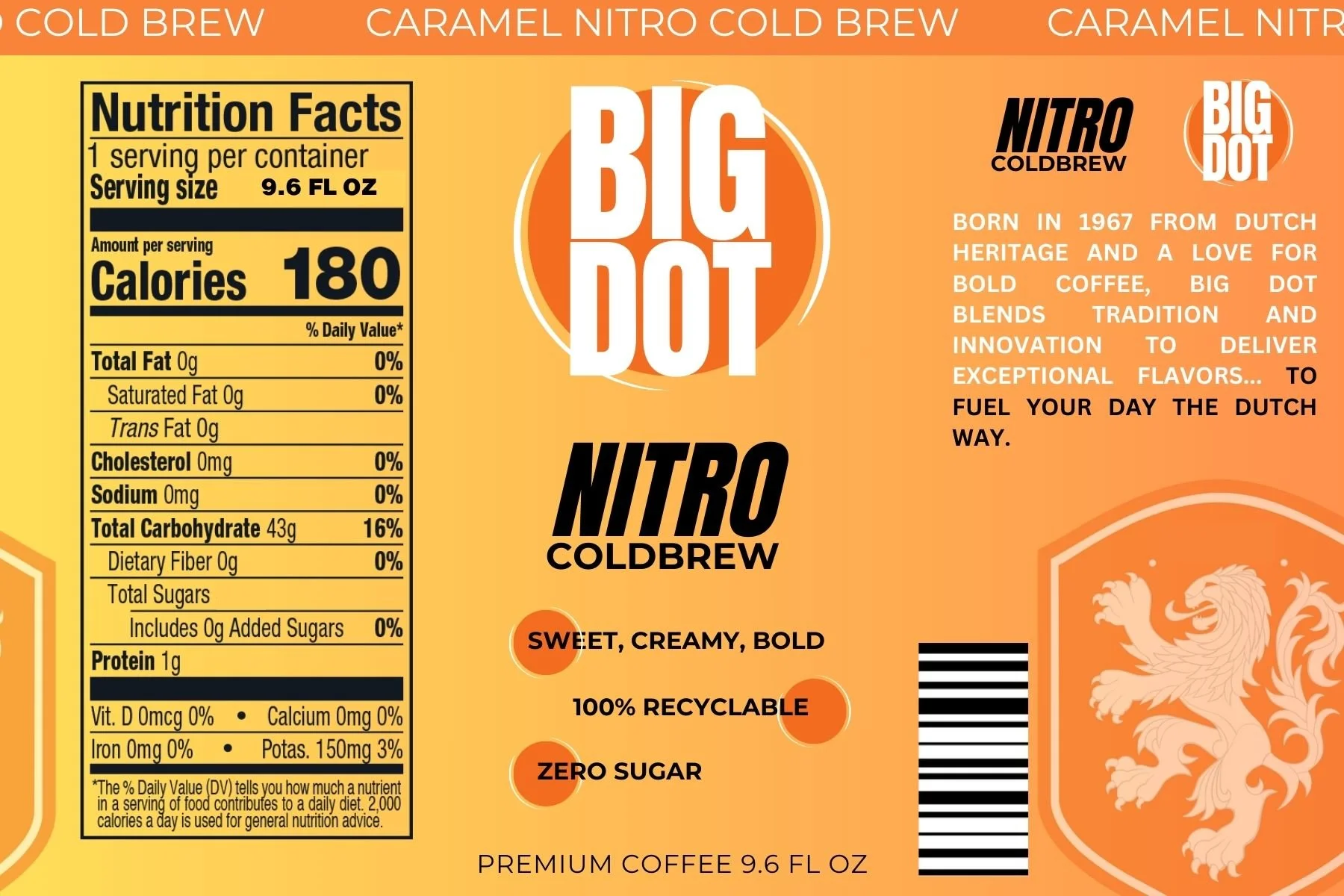
BigDot’s Carmel Nitro Cold Brew
For the Nitro Cold Brew product, I designed a label that reflects both the heritage and brand identity of the company we created. In today’s highly competitive beverage market, where sports drinks and ready-to-drink coffees are trending, it was essential to create packaging that would stand out on crowded shelves at gas stations or grocery stores.
The design uses bright, energetic colors and bold typography to capture attention while maintaining balance with intentional white space. The flavor is prominently bannered at the top, ensuring clear communication for consumers. Additional highlights, such as the product’s advantages, are presented directly on the label to persuade buyers by differentiating it from competing products.
This packaging combines heritage, clarity, and modern appeal, delivering a design that communicates both tradition and innovation in every detail.
BigDot’s Oat-milk Vanilla Double Shot Espresso
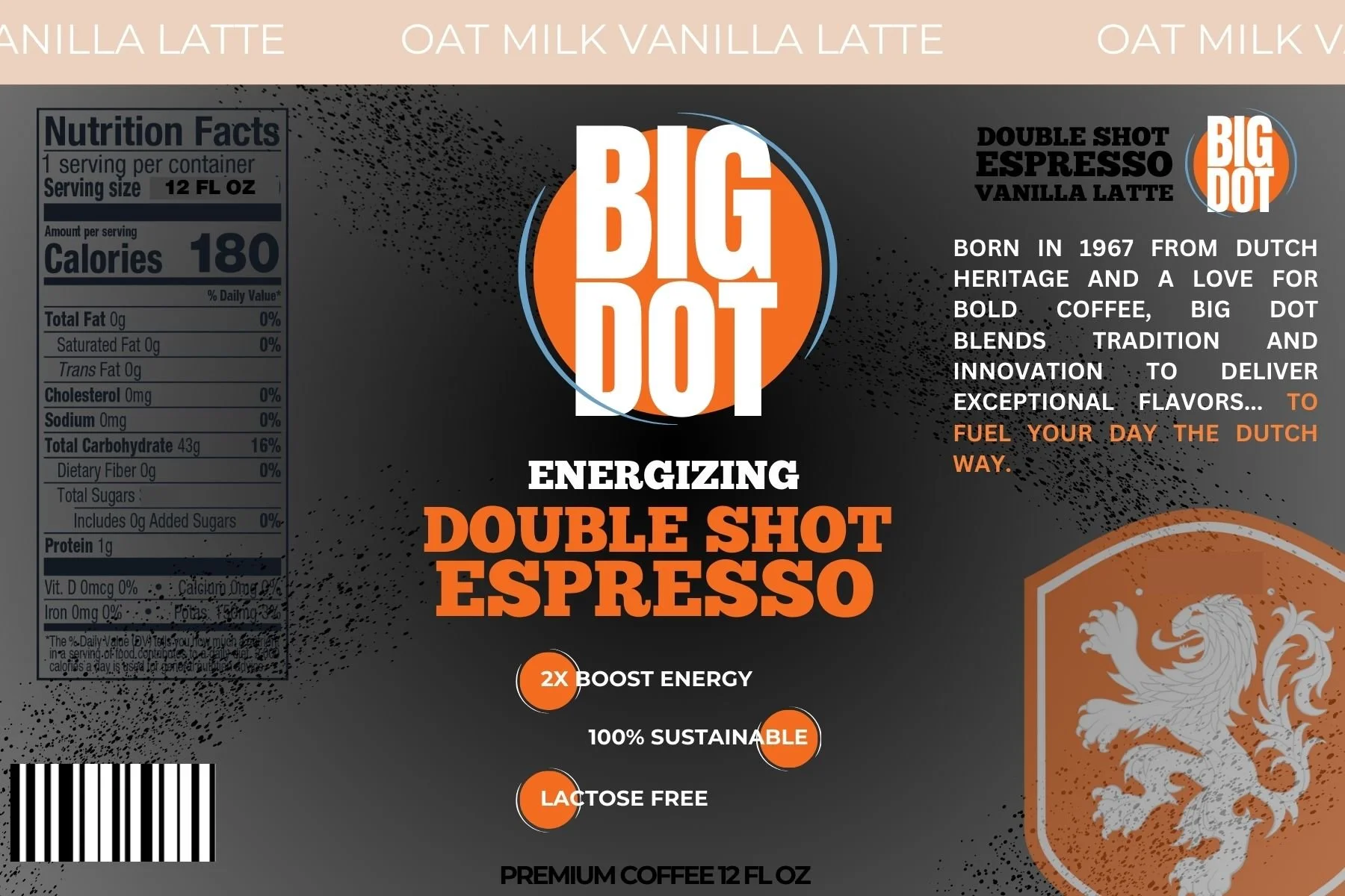
For this Energizing Double Shot Espresso design, the target audience was health-conscious young adults who value sustainability but also seek a reliable boost of energy. Unlike sports energy drinks, this product is positioned as a smarter, cleaner alternative—something functional yet mindful.
The label was intentionally kept simplistic and bold, allowing the brand and product name to stand out more than the surrounding design elements. The black and orange color palette conveys strength, confidence, and energy, while still maintaining a premium look. Rather than relying on flashy graphics, the power of the product is communicated through direct messaging and striking hierarchy, making it easy to identify at a glance on a crowded shelf. This approach gives the bottle a trendy, contemporary feel that differentiates it from competitors while aligning with the lifestyle values of its intended audience.
Featured on Big Dot’s products, a simple and quick to remember slogan, “Fuel your day the Dutch way.” The inclusion of the Dutch heritage in the slogan pays homage to Big Dot’s rich history and creates an emotional connection with consumers, helping them remember and choose Big Dot’s product. Also, making sure the orange and yellow complement each other to grab your attention when walking by a sign or a side aisle.
Big Dot Promotions